Embossing vs Debossing on Tins: Which to Choose
Print gives a tin its colour; embossing and debossing give it texture. On tinplate, both effects are formed straight into the metal, so they add a tactile, premium quality that a printed graphic alone cannot reach. This guide explains embossing versus debossing, how each looks and feels, when to use one over the other, and what they mean for tooling and cost.
Embossing vs debossing: the core difference
Embossing raises an area of the metal so a logo, pattern or lettering stands proud of the surface. Debossing presses an area inward so the detail sits recessed below the surface. Both are created by forming the tinplate between a male and female die, so the effect is permanent, dimensional, and identical on every unit once the tooling is made. The choice between them is mostly about the effect you want under the light and under the fingertip.
How each one looks and feels
Embossing (raised)
A raised detail catches light on its edges and casts small shadows, so it reads clearly from a distance and signals quality the moment it is picked up. Because the high point sits at the surface, embossing pairs beautifully with a spot of metallic ink or a gloss varnish on the raised area, which is a common way to make a crest or brand mark shine.
Debossing (recessed)
A recessed detail feels more restrained and tailored. It is excellent for a discreet logo, a background texture, or lettering that you want to feel rather than shout. Debossing also protects the detail: because it sits below the surface, it is less exposed to scuffing than a raised element on a tin that will be handled a lot.
When to use embossing
- Hero branding: a logo or crest you want to be the first thing a customer notices and touches.
- Perceived value: spirits, premium confectionery and gifting, where a raised, catch-the-light effect justifies a higher price point.
- Combining with metallics: raise the element, then hit it with gold or silver ink for a jewel-like highlight.
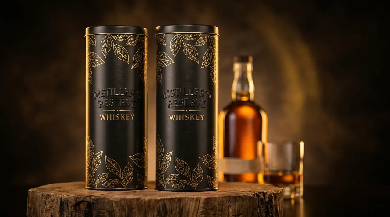
Raised branding is a familiar cue on premium embossed tin boxes for spirits and gift sets, where the texture does as much selling as the label.
When to use debossing
- Understated luxury: a subtle, tailored mark that rewards a closer look.
- All-over texture: linen, hammered or geometric backgrounds that add depth without competing with the print.
- Durability: details that must survive heavy handling, since a recess resists scuffing better than a raised edge.
Combining relief with print
Emboss and deboss are rarely used alone. The real power comes from registering them with the printed artwork, so a raised crest lands exactly on its printed colour, or a debossed line follows the edge of an illustration. This is called registered or in-register embossing, and it is where full-colour custom printed tins become genuinely premium objects.
A few combinations that work well:
- Emboss plus gloss spot varnish: a raised, shiny logo against a matte printed background.
- Deboss plus metallic ink: recessed lettering filled with gold or copper for a stamped, foil-like read.
- Emboss and deboss together: a raised motif inside a recessed panel for layered depth on one lid.
You can also combine either effect with a soft-touch or textured varnish so the surface feels as considered as it looks.
Why relief works: the psychology of touch
There is a practical reason relief is worth the tooling. Print is a visual signal; embossing and debossing add a second, tactile signal that the brain reads as craftsmanship and value. When a customer runs a thumb over a raised crest, the object feels considered and expensive before they have read a word of the label. That is why relief is so common on spirits, premium confectionery and gifting, where the buyer is paying partly for the experience of the object itself. On a shelf crowded with flat printed packaging, a tin that catches the light differently and rewards touch stands out for reasons the shopper may not consciously name.
How deep can you go?
Relief on tinplate is measured in fractions of a millimetre, and there are sensible limits. The metal can only be drawn so far before the shape distorts or the print cracks over the high point, so bold, generous forms reproduce far better than tiny, sharp detail. Broad crests, clean lettering and simple patterns are ideal. Very fine serifs, hairlines and dense micro-texture tend to soften or disappear. If a design relies on delicate detail, it is often better carried in the print and reinforced with a simpler embossed shape around it, rather than trying to form the fine detail into the metal itself.
Registration: why alignment matters
Because relief and print are two separate processes, they must be aligned so the raised or recessed area matches the graphic precisely. Good registration is what separates a crisp, deliberate effect from a blurry one where the highlight sits slightly off its colour. Allowing a small tolerance in the artwork - avoiding hairline detail right at the edge of an embossed shape - keeps the result sharp across a full run.
Cost and tooling
Both effects need a dedicated embossing/debossing die, which is a one-off tooling cost tied to your design. There is no meaningful price difference between raising and recessing the same shape - the tooling effort is comparable. What drives cost is the number of separate relief areas and how tightly they must register with the print, not the direction of the relief. Once the die exists, the per-unit cost of the effect is small and consistent across the run, which is why relief is such an efficient way to lift perceived value at volume.
Design tips to keep tooling efficient
- Keep embossed strokes reasonably bold; very fine lines lose definition when formed.
- Group relief into one artwork layer where possible to simplify the die.
- Decide emboss versus deboss before final artwork, as it affects how you build shadows and highlights in the print.
Which should you choose?
Choose embossing when you want the branding to project confidence and catch the eye and hand immediately. Choose debossing when you want quiet, tailored detail or a durable all-over texture. Many of the most memorable tins use both, plus a spot varnish or metallic ink, to build depth in layers. If you are not sure which reads best for your product, request a quote with your logo and a reference you like, and we will advise on the effect and tooling.
¿Tiene una lata en mente?
Indíquenos la forma, el tamaño y sus artes gráficas. Le enviamos un presupuesto y una muestra gratuita, y respondemos en cuestión de horas.
Solicitar presupuesto